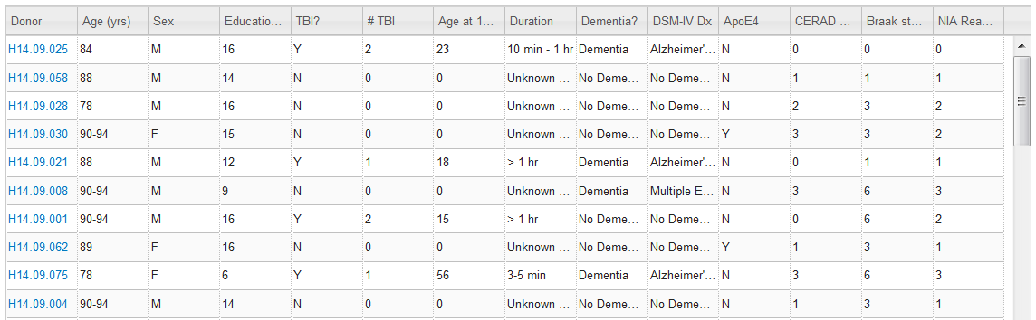
The Adult Changes in Thought (ACT) study is a longitudinal population-based prospective cohort study of brain aging and incident dementia in the Seattle metropolitan area. This cohort includes 5,000+ participants of which more than 700 have agreed to autopsy upon their death. From this smaller population who agreed to an autopsy, participants who had experienced at least one mild to moderate traumatic brain injury (TBI) with a loss of consciousness were chosen for this study, along with sex-, age- and post mortem interval- (PMI) matched controls. The specimens page lists this cohort sub-group in a sortable matrix, which allows for exploration of the donors by various demographic and/or pathological features.
Clicking on the column header will sort alphanumerically, clicking twice will toggle between ascending and descending order.
Clicking on a link from the Specimens page or clicking on a circle from the t-SNE plot from one of the data snapshots will open a specimen detail page. This page allows access to the data collected from this donor including Gene Detail, Gene Set, Neuropathology Metric Detail, Neuropathology Metrics, Donor Detail and Image Data.
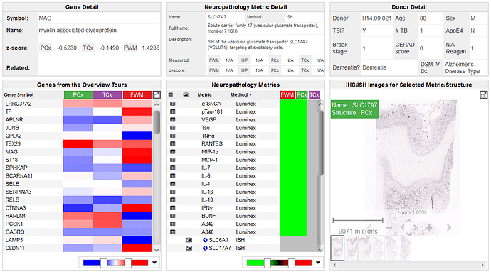
Once a data point is selected in the gene set panel, details of that gene will populate this space including the gene symbol, the gene name, the expression value from the RNA-Sequencing data, and a link to other Allen Institute datasets that have measured this gene.
The gene set panel is populated by the genes in the data snapshot (if you linked from a specific snapshot) or by the entire gene set that was used in all the snapshots (if you arrived from the Specimens page). The column headers are the samples from this donor that were sequenced. The gene set is a smaller version of the heatmap from the RNA-Sequencing data limited by the number of genes and the the donor. The icon in the top right-hand corner of the gene set display will link you to the RNA-Seq data for all donors and samples.

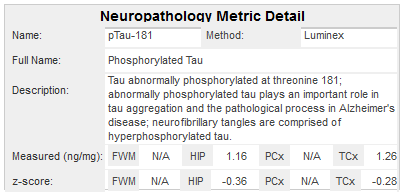
Once a datapoint in the neuropathology metrics display is selected, metric detail will populate this panel (and if the metrics came from an image, the image will also populate the image data panel) including the short and long names of the metric, the method used to collect the metric, a description of what the metric is and it’s significance, and the values collected or calculated.
This panel lists all the neuropathology assays collected on this donor. To populate data from this panel into the neuropathology metric detail panel, click on a data point in the heatmap.
The donor detail panel is populated with metadata from this donor including Donor ID, Age, Sex, Reported TBI, tbi, Presence of ApoE4 allele, Braak stage, CERAD score, NIA Reagan, Dementia diagnosis and DSM-IV diagnosis.

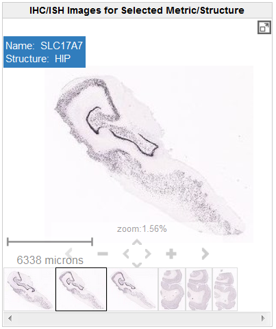
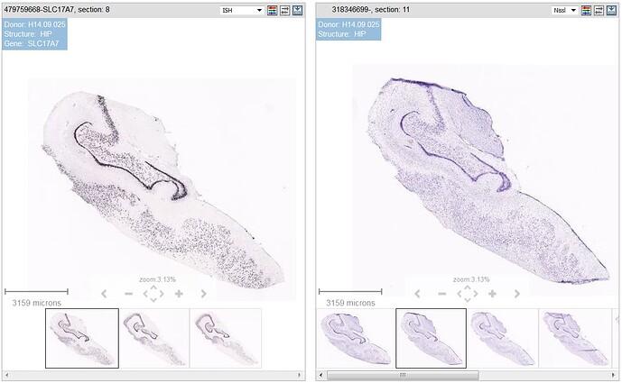
The image data panel is populated once a data point has been selected in the neuropathology metrics panel. This image viewer includes a main viewer, thumbnail views of all the images in the series - which when selected will bring up the image in the main viewer, the name of the assay and the location in the top left-hand corner of the viewer and on-screen navigation tools. Zoom in and out with the onscreen tools or use the keyboard commands.
In the top right hand corner of the viewer is an icon that will take you to a High Resolution Image Viewer.
Once you click on the full screen viewer button, you will be taken to a screen with side by side viewers (when available). The left hand viewer shows the image series you launched the viewer from and the right hand viewer displays the closest reference image from the same specimen block. This viewer is very similar to the viewer on the donor page with more functionality (see the toolbar features).


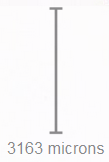
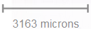
Shows the current viewing resolution of the image, in microns. This value dynamically changes as you zoom in/out of the image. You can position the scale bar anywhere on the main image by dragging the scale bar by its ruler.
You can toggle the orientation of the scale bar from horizontal to vertical by clicking on the scale bar text. When you download an image, the scale bar is not included with the image.

The Expression Mask image display highlights those cells that have the highest probability of gene expression using a heat map color scale (from low/blue to high/red).

Learn about Rna Sequencing Of The Aging Dementia And TBI Project with comprehensive guides and examples from Allen Institute for Brain Science.
To complement the protein quantification and histological analysis of tissues from this cohort, RNA Sequencing was run on 377 samples taken from cortical grey (parietal and temporal) and white matter (parietal) and hippocampus, with a minimum of 30M 50bp paired-end reads per sample.
Searching is available using three methods: (1) Gene Search, when looking for a specific gene of interest, (2) Differential Search, to find enhanced gene expression when comparing different brain regions and donors and 3) Correlative Search, to find regions and donors that exhibit similar gene expression to a “seed gene” selected from the results of a Gene or a Differential search.

To browse curated differential searches, click on the desired search term from the RNA-Seq landing page.
When searching for a specific gene of interest, type the unique identifier into the “Filter by Gene Name, Gene Symbol or Entrez Gene ID” text box and either hit enter or click “Search”. You can also narrow your search by selecting a brain region(s) and/or filtering by donor. Default searches query over all donors and all regions. Your search results will open in a heat map viewer.

Without a specific gene marker to initiate your search, a differential search can be useful in that it will look for genes enhanced in the brain region or donor you are interested in. To perform a differential search, you must select target and contrasting brain regions and donors. Select one or more brain regions from the drop-down menus. Filtering by donors requires selecting from the matrix that opens when you click in either text box. The toggle switch to the right of the text boxes will exchange the Target and Contrast selections.

Once you have selected your search criteria, clicking “Search” will open up your results in a heatmap viewer.

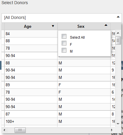
Each of the different search methods provides an opportunity to limit the donors based on metadata collected in the study. To filter the data, click in the text box associated with donor choice to open a matrix. Filter the parameters by selecting the arrow in the column headers to choose parameters. Filter parameters are listed in the table below. For more information regarding the data collected on this cohort, please see the ACT Cohort whitepaper in Documentation.
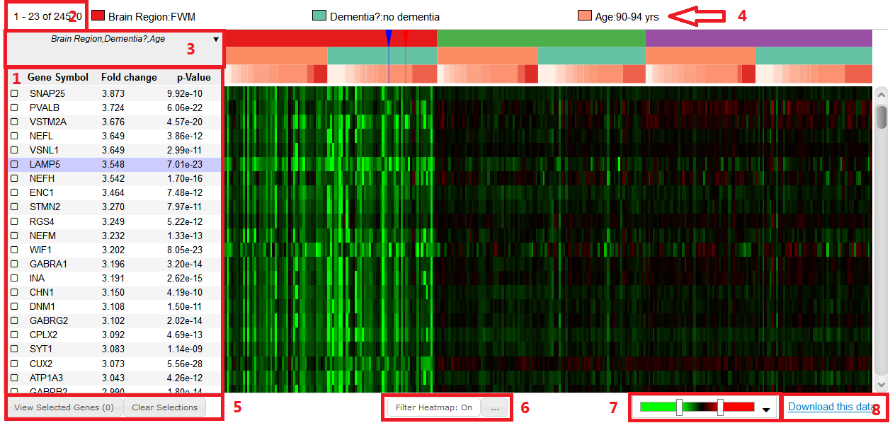
Once you have conducted a gene or differential search or have selected one of the curated searches, your results will be loaded into a heatmap viewer. Once you have clicked on a data point in the heat map, metadata will be populated in the summary above the heatmap.

The metadata summary outlines several of the donor categories, metadata on the gene (including symbol, name, expression values and related data) and the find correlates and Genome Browser functions.


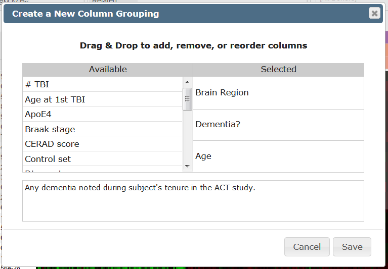
The column headers on the x-axis of the heat map are a feature that can be changed by the user. By default, the column headers are Brain Region, Dementia? and Age (in that order), but any of the donor parameters can be used to sort the columns. Clicking the arrow in the box in the upper left-hand corner of the heatmap will open a list of groupings including any customized groupings that the user has created. To create a new grouping, click on “[Create new grouping…]”, and a window will open allowing you to create a new grouping. Remember to save your selection.

To remove a grouping, hover the mouse over the grouping and a garbage can will appear, click the can to remove the grouping.
To restrict the amount of data that are displayed in the heatmap, select the “Filter Heatmap” button below the heatmap. Filtering your heatmap is a two-step process: first, select the “…” box to restrict your features, making sure to save your selections, and then toggle the filter heatmap feature between “On” and “Off” by clicking the “Filter Heatmap” button.

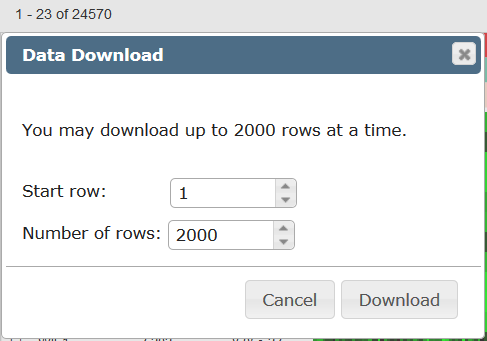
Once you have found the data that you are interested in downloading and analyzing off-line, click on the “Download this data” link. There is a limit to the amount of data you can download at one time, choosing the start row and number of rows (up to 2000) a download of three .csv files; one with metadata for the rows, one for the columns and a matrix containing the FPKM values.

To change the contrast of the heatmap display, click and drag the slider bars in the color scale below the heatmap. Clicking on the scale will open a window allowing the user to choose from several color scales or the log2 FPKM view.
Once you have found a gene of interest either by performing a gene or differential search, you can look for brain regions or donors that show a similar pattern of gene expression using the “Find Correlates” feature.
From the heatmap, click on a gene to load that “seed gene” into the search box. You have the option to select a brain region(s) and or donor metadata before clicking “Search”. All genes with similar expression patterns as your seed gene will then be displayed in the heat map. If you filtered your search by region or donor, your heatmap will only display those features. Turn off the “Filter Heatmap” function to see all the data.

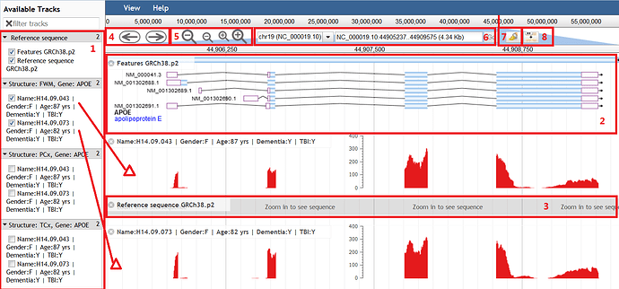
Once you have selected a seed gene and donor (by clicking on the heatmap), that gene and donor will be available to load into the Genome Browser. If specific donors are not listed in the Donor text box, only the donor associated with the data point selected will be loaded into the genome browser. To load more than one donor, select multiple donors from the donor drop down menu.

Learn about Overview Of The Aging Dementia And TBI Project with comprehensive guides and examples from Allen Institute for Brain Science.
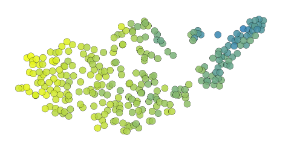
The Aging, Dementia & TBI study incorporates many disparate data modalities - histology, protein quantification, gene expression and clinical diagnoses - which makes visualizing relationships and correlations within the data challenging. To enable exploration of the data, we have created unique data snapshots with visualization that incorporates t-Distributed Stochastic Neighbor Embedding (t-SNE) Plots and Parallel Coordinate Plots. These snapshots are curated walk-throughs of the data as an entry for exploring the data.

Each image from this page links you to a subset of the data and describes, in story-form, possible interpretations of the data.

This method of data visualization is a technique that reduces the complexity of multi-dimensional data to two dimensions. In each of the data snapshots, the data is embedded by a limited number of parameters and the data plot coupled to the parallel coordinate plot allows the color of the data points to be changed based on independent data parameters. In some of the examples, there is the option to alter the embedding of the data (by clicking on the check box above the radio button in the parallel coordinate plot. For more information on this data representation, please visit t-SNE – Laurens van der Maaten.
Clicking on one of the data points will lead to a specimen detail page where all data collected from this donor can be accessed.

This data representation allows for n data modalities to be plotted against n distinct axes. For each of the snapshots, the data modality is listed above each axis with a radio button that enables coloring of the t-SNE and plots according to that parameter. Embedding of the data in the t-SNE plot can also be altered by clicking in the checkbox over an axis (when available). Each of the coordinate axes is equipped with a slider bar that enables a subset of that data to be highlighted. Hover over the axis to enable the slider function, then click and drag to limit the data represented. Excluded data points will be indicated by colorless circles.
This snapshot demonstrates the power of these visualizations using an obvious way to embed the data, genes specific to one sex or the other. In this example, the data were embedded by the top 10 genes enriched in expression in males and the top gene enriched in expression in females. This allows for an obvious separation of the dataset in the data space. With the data clustered by sex, querying other parameters, such as demographics, diagnoses and histopathology becomes a simple matter of coloring the dataset by that parameter (by clicking the radio button) and/or limiting samples using the slider bar for each axis.
In this snapshot, the data were embedded by genes that are differentially expressed in each of the brain regions sampled. This lays out the differences between the cortex and hippocampus and highlights the expression similarities of the cortical regions. With this clustering, you can query region specific genes as well as other demographic, histopathological or diagnostic parameters.
This snapshot embeds the data based on gene expression enhanced in the white matter over the grey matter and vice versa. Not surprisingly, distinguishing these tissues highlights markers for excitatory and inhibitory neurons in the cortex, and glial cells in the white matter. With this clustering, you can then query demographic, diagnostic and neuropathologic parameters.
The data in this snapshot were embedded by gene markers for inflammation and clustering in this manner allows for querying the data by protein concentration as well as other demographic, diagnostic or neuropathologic parameters.
The data in this snapshot were embedded by the genes most differentially expressed in the hippocampus of donors given the diagnosis of dementia over those who had no such diagnosis. This data clustering allows you to explore relationships of some specific gene markers, as well as other diagnostic, demographic or neuropathologic parameters.
In this snapshot, the data were embedded by genes differentially expressed in the cortex of donors who self reported at least one traumatic brain injury (TBI) with a loss of consciousness vs controls. The data clustered in this manner can then be queried for other factors regarding TBI, as well as other neuropathologic, demographic or diagnostic criteria.
In this snapshot, the data were embedded by the levels of two proteins known to be increased in the brains of patients inflicted with Alzheimer’s related dementia; phosphorylated tau, pTau, the form of tau present in neurofibrillary tangles, and the neurotoxic amyloid peptide αβ42, which is present in amyloid plaques. Clustering the dataset in this manner allows for querying the samples by other neuropathologic, demographic and diagnostic criteria.
Learn about Documentation Aging Dementia And TBI Project with comprehensive guides and examples from Allen Institute for Brain Science.